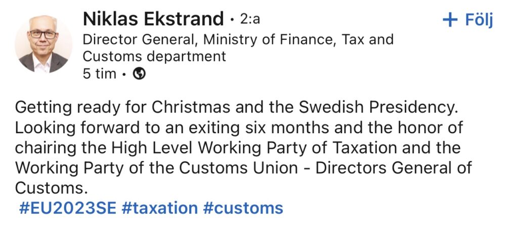
Sweden – A week to the EU Precidency
The Presidency’s visual identity was influenced by how the light changes between winter and summer in Sweden, and the colours yellow and blue, which the EU and Sweden share.

The logo represents solidarity and community. By highlighting different parts of the logo, more messages stand out:
The main logo emphasises the Swedish Presidency and our contribution to the EU.

The version with ‘we’ and ‘2023’ reflects the fact that the Swedish Presidency acts in the common interest of the EU.
The version with ‘we’ and ‘eu’ illustrates the connection between EU Member States and how important the EU is to its citizens.
The link between the ‘n’ and the ‘u’ illustrates the affinity between EU citizens, and the yellow punctuation mark symbolises determination.
Read more on the Presidency website: https://t.ly/ff8t
You must be logged in to post a comment.