Understanding trade
It is commonplace to emphasise that we are now in a new era of globalisation, marked by the rise in the importance of emerging economies. But what does this really mean?
Richard Baldwin, author of the Great Convergence, argues that what is new is the combination of northern technology and southern labour. But he adds that for the present, global value chains are still mainly regional. Intermediate goods like car parts are primarily moved around within a regional “factory” (North America, Europe, East Asia), and then final goods are shipped to the user. China is the exception to this rule with its use as a factory economy by the EU and US.
It is worth testing this idea by looking at the patterns in the data since 2002. We have organised world trade into country groups: North America, Europe, East Asia, South-East Asia, South America, Less Developed Countries, and the Rest of the World.
So then, who trades the most?
Well, the chart below provides a snapshot of the share each region had in world trade in 2016 and the changes since 2002. What we see is that the greatest shares of both imports and exports are accounted for by Europe, followed by East Asia, the Rest of the World (RoW) and then North America. Trade flows are calculated using UN COMTRADE import data.
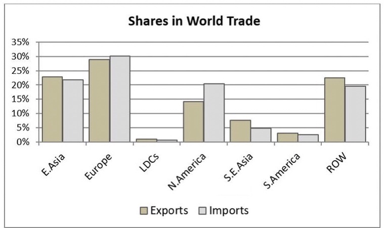
Image: The Conversation
The next chart gives the percentage point changes in these shares between 2002 and 2016. It shows that East Asia has increased its share by five points. The other big gainer is the Rest of the World, whose constituent countries have seen their share of world imports increase by three points and their share of exports increase by seven.
Growth here, and for South-East Asia and South America, reflects the growing importance of emerging markets. And this is backed up by declines in the share of imports and exports for both Europe and North America.
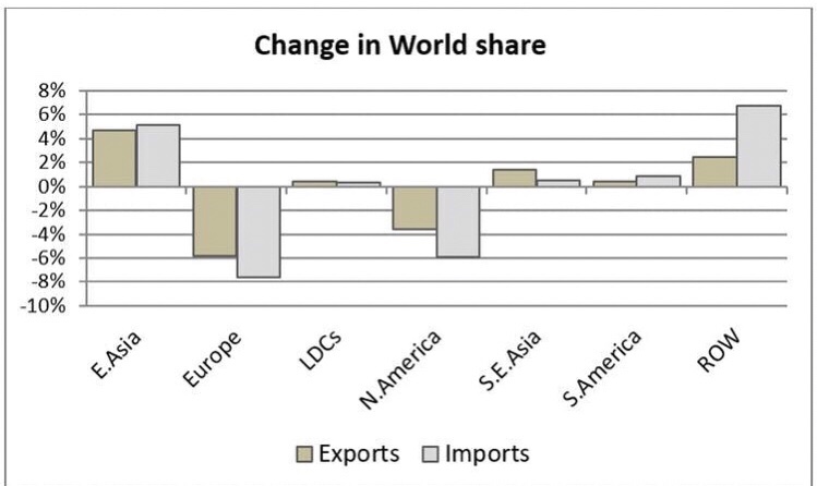
Image: The Conversation
Who trades with whom?
It is commonly argued that distance matters in international trade; that countries tend to trade most with countries which are closer. The fact that the cost of moving people hasn’t fallen along with the cost of moving goods and information may accentuate this. The heat map graphic below explores this.
Each matrix gives the share of trade between the partners. The darker the shade, the more important a trading partner is to that country. The top two tables show the state of play in 2002; the bottom two show 2016. Imports are on the left; exports on the right.
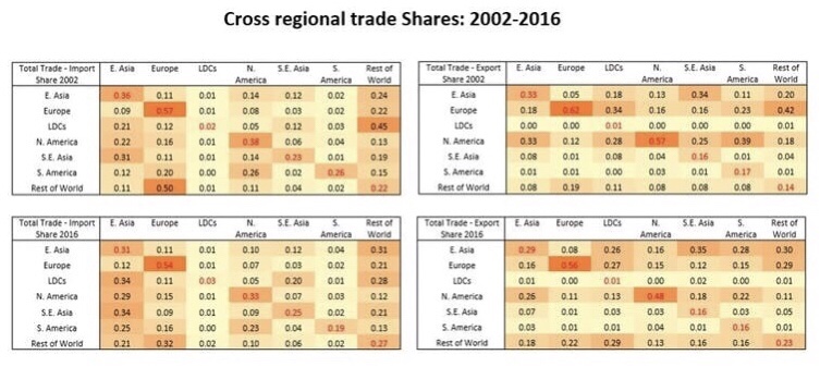
Image: The Conversation
One thing that is immediately clear is how Europe operates on a different level in terms of the intra-regional share of trade. In 2016, 54% of imports into European countries came from other countries on the continent. It’s at 56% for exports. The corresponding figures for North America, the next biggest, were 33% and 48%. East Asia comes in at 31% and 29%. It helps explain the hand-wringing over Brexit from businesses worried about even small barriers to this market. Just-in-time production methods are very vulnerable to border holdups.
That said, while intra-regional trade is important, and there remains much truth in the idea that global value chains are primarily regional, it appears this may be in decline. We have pulled this out into the graph below which gives the change in the intra-regional trade share for each of the regions. The only grouping which sees a rise in trade with itself is the RoW, and it’s fair to note that this is not a regional grouping geographically.
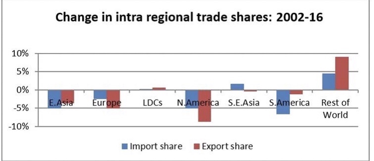
Image: The Conversation
More generally, the heat map table above shows a rise in the importance of the RoW countries as destinations for the exports of other groupings. Their share in the exports of East Asia has gone up from 8% to 18% between 2002 and 2016. For Europe it rose from 19% to 22%; for North America from 8% to 13%.
The role of intermediates
To truly understand the story we need to get a handle on trade in services and on intermediates. This market for things like the switches on a food mixer, or the consultancy work on a company merger have become more and more important in world trade.
The following chart gives the share of intermediates in total trade. From this we see an increase in the share of intermediates from 48% to 52%, and in total trade from 35% to 39%. In other words, more parts are being sourced away from where final products are manufactured.
We do see a slight fall in the share of services in total trade. Services figures are notoriously unreliable but these estimates are consistent with IMF and WTO estimate. In fact, much of recorded trade in goods reflects services embodied in goods, for example where software is used in design or manufacture.
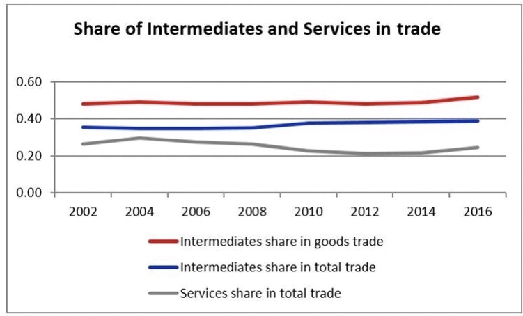
Image: The Conversation
Even for the growing trade in intermediates, the data show the same trend away from intra-regional activity. You might wonder if that’s just down to how we built the groups, but it’s not. The table below shows that even within categories of intermediates there remains a trend towards a slightly declining importance of intra-regional trade. It seems to be happening within almost all categories.

Image: The Conversation
What does all this tell us? Well, trade is still heavily regional. But China’s growing global role in the last 15 years has not prompted East Asia as a region to switch its focus to internal markets. And even Europe may be weaning itself off the dominance of trade between its constituent countries. Recent news about the US’ relationship with Canadian firm Bombardier might make you think North America’s regional favouritism is fragile too. Genuine protectionism from Washington in the future may have a deep and lasting effect on this data, but right now we are still moving towards – and not away from – true globalisation.
Source: WEF/Writers: Peter Holmes & Michael Gasiorek
You must be logged in to post a comment.